


PGi is the world's largest dedicated global provider of collaboration solutions. As part of a consolidation of six redundant mobile web conferencing apps into two (one iOS and one Android), my team and I redefined the enterprise mobile meeting experience for GlobalMeet's on-the-go users. This project took place over mid to late 2017; both iOS and Android apps launched in Q1 2018.
Objective
Our goal was to reinvent and simplify the experience of taking a GlobalMeet meeting while remote. In the mature web conferencing market, development time taken to consolidate our existing apps needed to be used to create a new product measurably more desirable than competitor offerings.
Challenges
1. GlobalMeet’s product stakeholders embraced a desktop-focused bias, having historically reproduced the desktop GlobalMeet experience 1:1 on mobile phones. We used contextual analysis and user surveys to convince desktop-focused stakeholders to heed mobile-first trends.
2. Many enhancements involved removing friction from onboarding or join flows, which often conflicted with engineering efforts. To produce a solution best for the user, not what’s best for PGi tech infrastructure, we persuaded developers to reduce response times by asking them to help with user testing themselves on occasion.
Role + team
Lead user experience design; partner with a dedicated product manager and loyal, enthusiastic offshore engineering team.
What we inherited
We began with six incumbent similar-featured conferencing and web meeting apps across two brands (iMeet and GlobalMeet) across iOS and Android, with an estimated 80,000+ installs and tens of thousands of daily active users. Some of these were built years ago with no design input at all; others appeared more up-to-date.
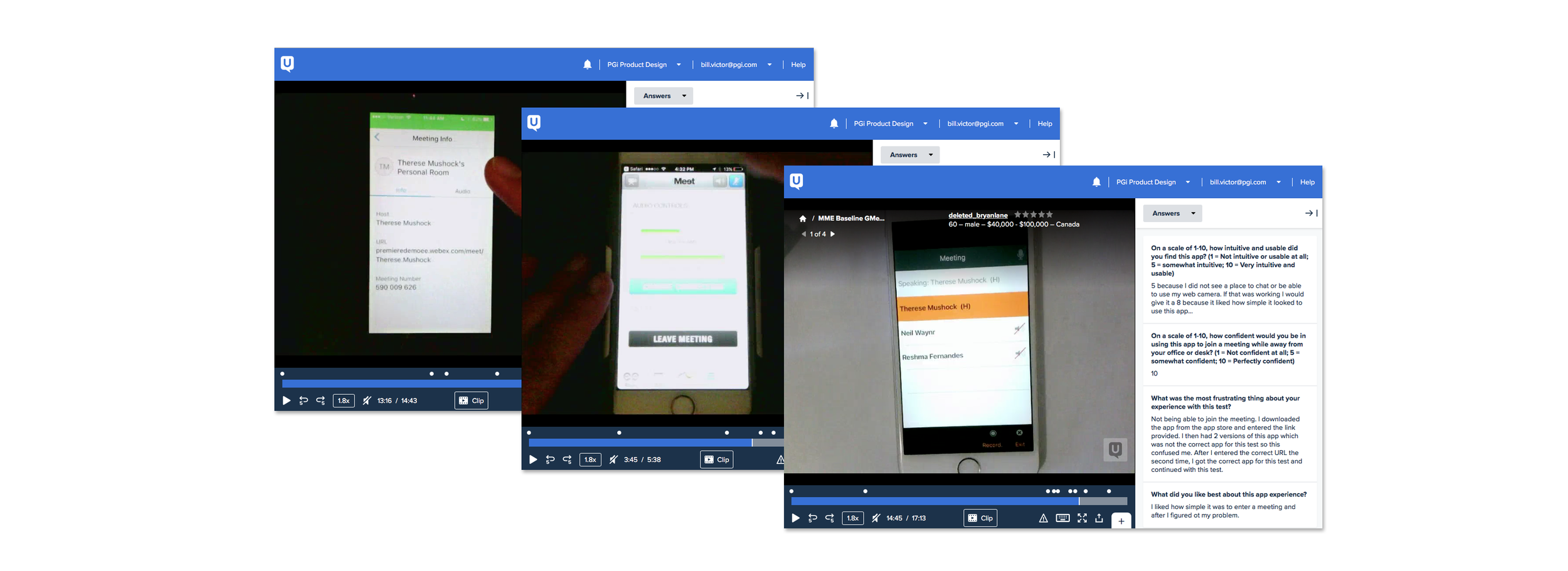
To commence research, we orchestrated test meetings via usertesting.com of the existing iMeet and GlobalMeet apps plus competitors WebEx and Skype for Business, measuring discoverability and usability across basic onboarding, joining and meeting functions. We also surveyed users on their common scenarios and struggles, collecting user research data to construct a clear picture of today’s remote meeting context. Contextual analysis revealed many users take calls while commuting, but also that many work-from-home users treat their phones like a mini Polycom.
Experience Design Strategy
Throughout the design research phase and immediately after, we moved through the following analysis and strategy steps:
1. Map the mobile meeting experience and identify pain points. We crafted an experience map and empathy model using qualitative survey data from usertesting.com. Both of these proved key in justifying design decisions down the road to desktop-focused stakeholders.
2. Redefine and socialize project goals. We drove alignment with product and engineering by leading sessions to define three primary north-star epics in delivering a differentiated, simplified experience. The main idea of the epics explicitly involved providing contextual service intelligence with features, instead of duplicating desktop features 1:1.
3. Craft and test a newly simplified app experience that addresses user contexts and concerns discovered during research and mapping. To kick off the design phase, we set about microframing and wireframing a wholly new mobile meeting experience following a set of several actionable design directives geared toward servicing remote meeting users in context.
During the research phase, we noticed many meeting apps include too many tabs, excise, or obscure modal views resulting in users getting lost mid-meeting, especially if they need to exit out of a video mode just to mute themselves or view a participant list. So we microframed the major meeting experience functions, then consolidated the navigational model via wireframing to limit format to three basic sections: Participants, Presentation and Chat.
The top concern for users when collaborating remotely is their audio controls ... and not just when joining. Mobile users are continuously managing background noise and toggling their speakerphone and mute settings throughout the call. Our own apps, and competitor apps, did not provide visible access to audio status (mute or live) — so we added a large audio control bar to make it easy for users to see and manage their audio status at a glance.
The mobile meeting experience presented a different usage signature than other apps. The most major difference is session length; most mobile apps including gaming, productivity and social media apps average 90 seconds to ten minutes in session length, but mobile meetings average 30-60 minutes. The second major difference is, mobile meeting users do not hold the phone in front of their eyes for the active session. Instead, users have the app open, but the screen is farther away on a car dashboard, tabletop, or even in their pocket.
To adjust for context, we designed the interface to be more readable from arms-length. The audio controls and text are formatted to be large, featuring generous hit areas for users who are only glancing at the screen momentarily to mute or unmute … then hastily return their eyes to the road or the phone to their pocket.
Many users we surveyed mentioned difficulty around viewing screenshared content while mobile, due to small screen sizes. To mitigate this as much as possible, we redesigned the content sharing view to include an all-new immersive viewing mode, featuring pinch-to-zoom and rotational controls.
We optimized a Join interface to only include recents and search; other apps included too much excise in finding a meeting to join, including much underused A-Z scrolls. While empathy-mapping the meeting experience, we realized that the first thing people want to see when they join is who’s present. Users want to know if they’re late or not, who still needs to join, and if discussion has started yet or not, so they can settle in. So, we default users to the Participants tab and guide them to the Presentation tab or Chat via badging if they don’t explore those views themselves before settling in to the meeting.
One of the most crucial aspects of an app’s experience design is what the product communicates to the user when things go wrong. During testing, many of our users indicated connectivity is a top concern when meeting remotely. So, we defined specific messaging to help users reconnect or take action when network issues arise.
Throughout the project, our team coordinated with the desktop experience team to match patterns and icons as closely as possible, while maintaining fidelity to mobile context. The end result is a consistent portfolio vision that effectively serves the user between platforms.
As we shaped the new mobile app, we laid foundation to connect user needs both immediately preceding and following their meeting experience, providing a roadmap vision for a truly intelligent, differentiated meeting product. As we continue to field feedback from the app's beta and release usage, these insights will shape and inform the product vision and roadmap.